Build an AI website in 60 seconds
AI generates your personalized website instantly with built-in scheduling, payments, email marketing, and more.
Start for free


24 website typography examples to draw inspiration from


Using the right typeface for your website doesn’t just help set the tone, but it also builds your brand personality and shapes how users experience your website. That said, great web typography plays a huge role in your platform as it can increase both engagement and conversions.
That’s why many modern businesses rely on AI website builders like B12 to help them choose the perfect typography for their platform. With its AI-driven design tools, B12 acts as an intelligent visual designer, recommending ideal font pairings that align with your industry, tone, and brand goals. Whether your website needs to look creative, modern, or professional, B12 automatically selects web-safe fonts that reflect your brand identity and maintain harmonious font pairings.
This article explores 24 stunning website typography examples across different industries, from bold and creative agencies to clean, professional services. Each example shows how thoughtful typography choices keep designs engaging while reinforcing brand identity.
How to choose the right typography for your website
Selecting the right font styles is a creative and strategic decision that serves a real user need. Below are four focused ideas to help you make the right font choices that perfectly match your brand identity and stay readable across screen sizes.
1. Match fonts to your brand personality
Whether you pick a serif font to signal trust and tradition or a sans serif typeface to feel modern and minimal, the goal is to have the correct font types that speak to your brand. A display typeface can add personality to your hero section, making it bold and expressive. For longer texts, however, it’s best to pair it with a calm, readable body font, like Nunito Sans.
For instance, Rhode has a clean, minimalist, and elegant brand aesthetic that reflects its focus on simplicity, purity, and understated luxury. This aligns perfectly with the brand’s rounded sans-serif typography, which features soft edges and generous spacing.
Another great example is Gymshark, a fitness brand with a bold, high-performance identity. This is echoed in its geometric sans-serif typeface, defined by strong lines and tight spacing that convey energy and precision.
2. Balance readability and design impact
A font that looks striking but is hard to read on a smartphone will cost you engagement. Use a generous line height and maintain a considerable line length for comfortable reading. B12’s AI website builder helps maintain font consistency across all devices, adjusting scaling so your typography looks balanced from desktop to mobile.
Pick web-safe fonts known for their legibility. Use tools that preview font weights and scaling, like Google Fonts or FontPair, to maintain clarity and consistency across desktop or mobile platforms.
3. Use hierarchy strategically
A good visual hierarchy guides the eye instantly with ease. Use bold headings, clear subheadings, and lighter body text to create contrast and distinctions in each section. You can also vary size, weight, and color to establish visual flow.
A well-structured hierarchy improves both scannability and readability. You’ll often see this on landing pages, where bold headers, lighter body text, and distinct call-to-action (CTA) fonts work together to guide visitors naturally toward conversion.
4. Limit font families
Sticking to two or three font families keeps your page looking tidy and intentional, while maintaining consistency across your website. To create harmonious font pairings, try combining a geometric sans serif font for your user interface (UI) with a refined serif for quotes or editorial sections.
Many AI website builders suggest combinations that maintain a cohesive look across headings, CTAs, and body copy. B12’s AI tool, for instance, recommends font pairings based on proven typography best practices, so your site stays polished without overmixing styles.
24 stunning website typography examples (across industries)
The examples below show how font choices send clear signals about a brand’s values and visual identity. Each website showcases the different font types that work for different industries, how they reinforce messaging, and why the choices work.
Creative agencies & portfolios
Here are 5 website typography examples that work well for portfolios and creative agencies because of their bold and minimalistic design that grabs attention and reflects confidence.
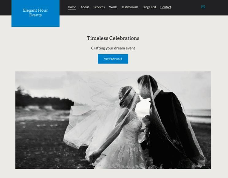
1. Radiant Capture
Crisp sans-serif fonts, generous margins, and restrained use of color, the site lets each image breathe while the text subtly reinforces mood and tone. This minimalist design highlights what matters most: the artistry.
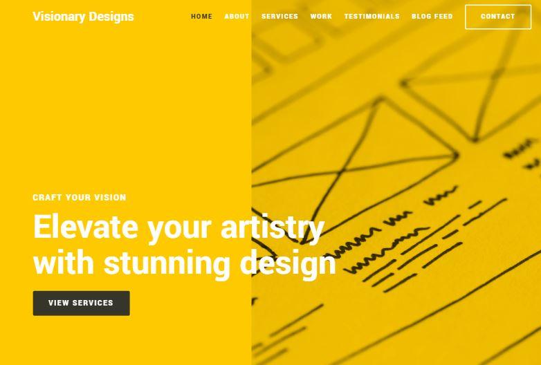
2. Visionary Designs
Visionary Designs uses a bold headline font that draws attention to the agency’s mission, while its light sans-serif body copy provides a professional, editorial finish. This typographic design communicates a brand identity that feels balanced and human.
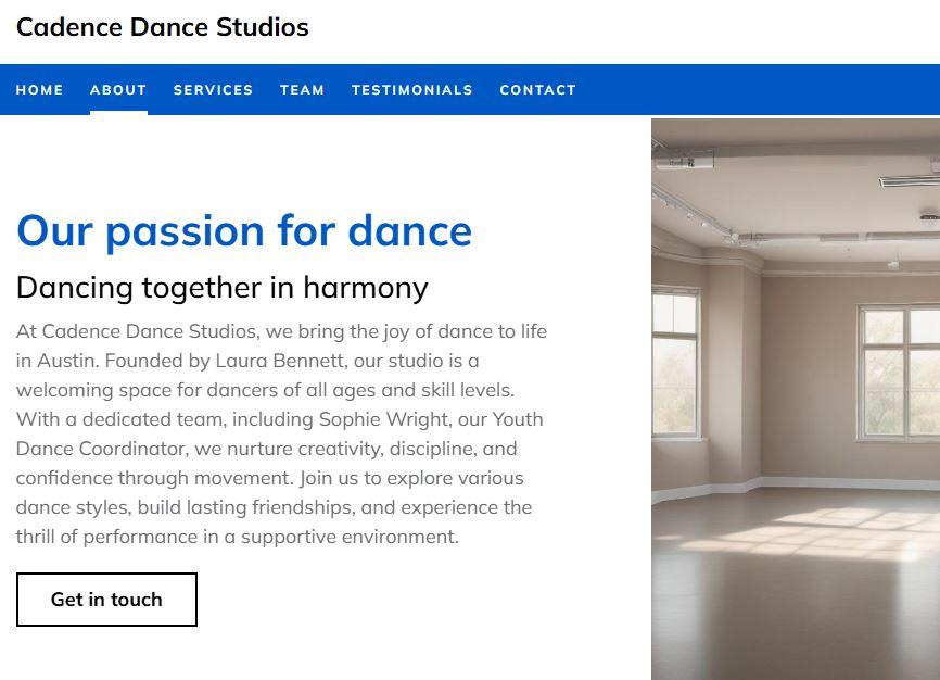
3. Jade Monroe Beauty
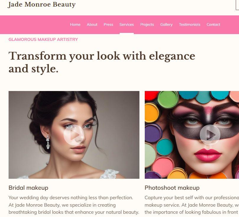
Jade Monroe Beauty’s website features a refined serif for the logo and a soft sans-serif for body text, giving it a clean and luxurious look. This font pairing complements soft imagery and balanced spacing, reinforcing a sense of grace and trust.
4. Rainbow Disruption
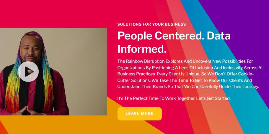
Rainbow Disruption stands out for its expressive, decorative text and subtle animated typography, used to reflect the creator’s bold, experimental style. Its dynamic typographic rhythm brings the brand’s energy to life.
5. Edge Forward
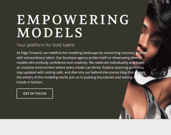
Edge Forward’s typography is straightforward and bold, using strong visual hierarchy to guide the eye from headline to CTA. Its type design builds a strong sense of professionalism that's ideal for modern designers and artists.
E-commerce & retail brands
Here are 5 web typography examples for e-commerce and retail websites that focus on readability and emotional tone.
6. Blooming Palette
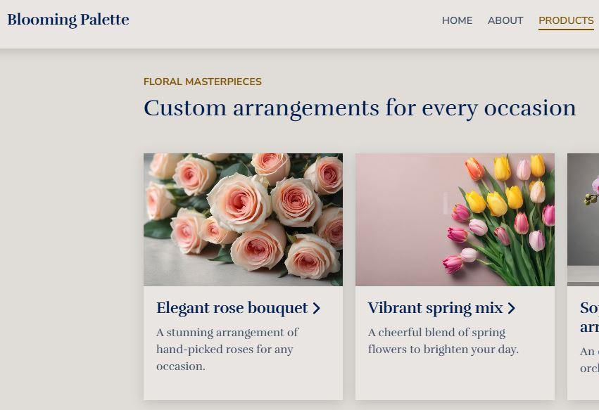
Gentle serif header paired with a clean sans-serif body, which creates a beautiful contrast. This font combination evokes warmth and artistry, making the website feel personal and handcrafted.
7. Smart Nest Solutions
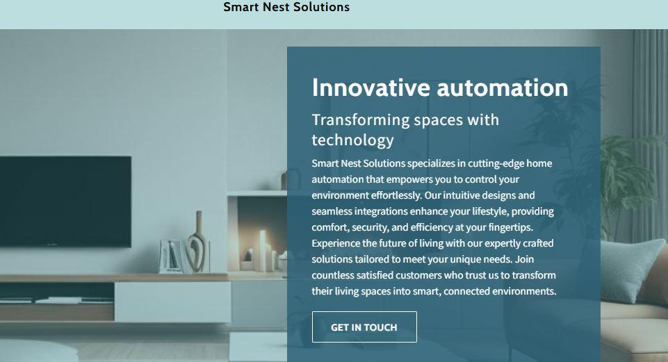
Precision and modernity through sleek sans-serif fonts that emphasize clarity and innovation. The minimalist font palette reinforces the company’s tech-forward image while maintaining trust and professionalism.
8. Precision Parts Co
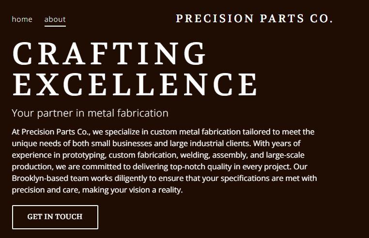
Bold sans-serif fonts and tight alignment that communicate strength and reliability. Its typographic consistency projects authority and efficiency – both key traits for B2B and product-based websites.
9. Manga Nest
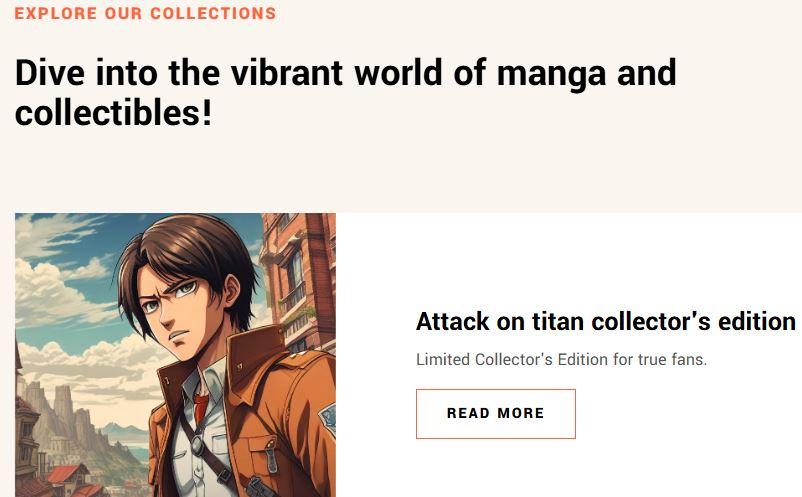
Bold headers and rounded typefaces contrast beautifully with expressive anime visuals. The fonts amplify the brand’s youthful tone while ensuring readability across digital devices.
10. Pure Essence Naturals
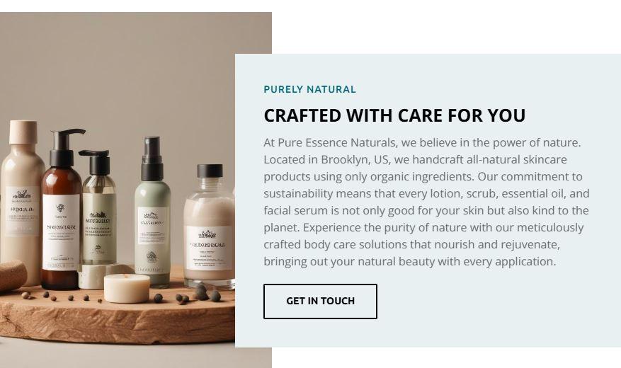
Refined serif typeface paired with soft neutral tones, creating a sense of trust and wellness. The typography reflects the product’s promise of balance and natural harmony.
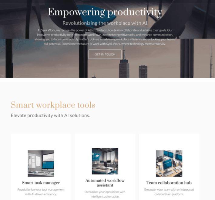
Tech & startups
A clean, geometric typography is the ideal fit for every tech and startup branding, as these fonts signal innovation, trust, and a modern feel.
11. Ledger Edge Live

Structured, high-contrast sans-serif fonts communicate clarity and precision. This creates an analytical yet human vibe that’s perfect for fintech and startup audiences.
12. NextGen Code Solutions
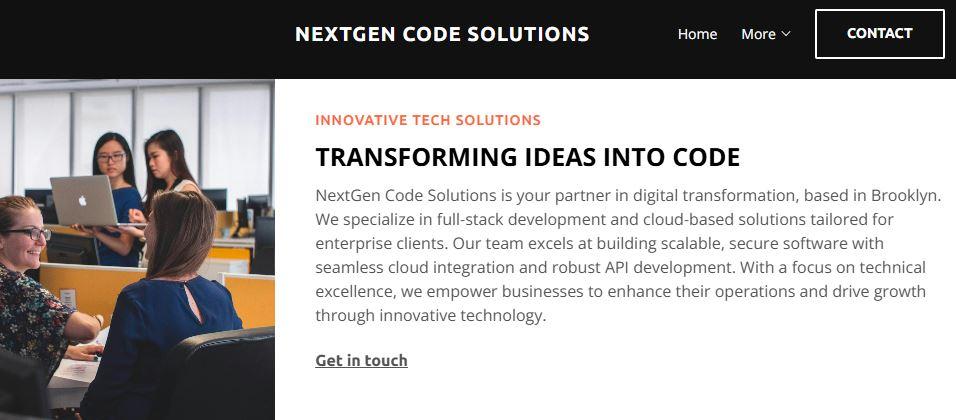
Crisp sans-serif typography paired with consistent spacing and subtle accent colors. The clean geometry of the fonts aligns with the company’s branding.
13. ProLogic IT
The combination of sans-serif and serif fonts, paired with a structured layout, reinforces ProLogic IT’s efficient and trustworthy brand image. The visual hierarchy supports fast comprehension and enhances scannability.
14. Vanta Shield
Paired italicized sans-serif and serif fonts create a visual hierarchy that stand out against contrasting background color. This font design projects innovation and high energy, truly a masterclass in creative use of typography.
15. Neural Edge Systems
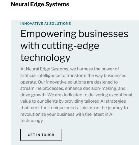
Sleek, sans-serif typography reflects the precision of AI technology. Its minimalist design, bold headlines, and balanced font weights demonstrate sophistication through restraint.
Service businesses (legal, financial, consulting)
For service-based businesses, typography shapes first impressions and builds trust. Many firms prefer clean sans-serif fonts because they balance formality and authority with a friendly, modern tone.
16. Atlas Law Group

Clean combination of sans-serif and serif fonts, along with generous spacing and contrasting colors. This design choice reflects the firm’s modern professionalism and reinforces client confidence.
17. Matten Law
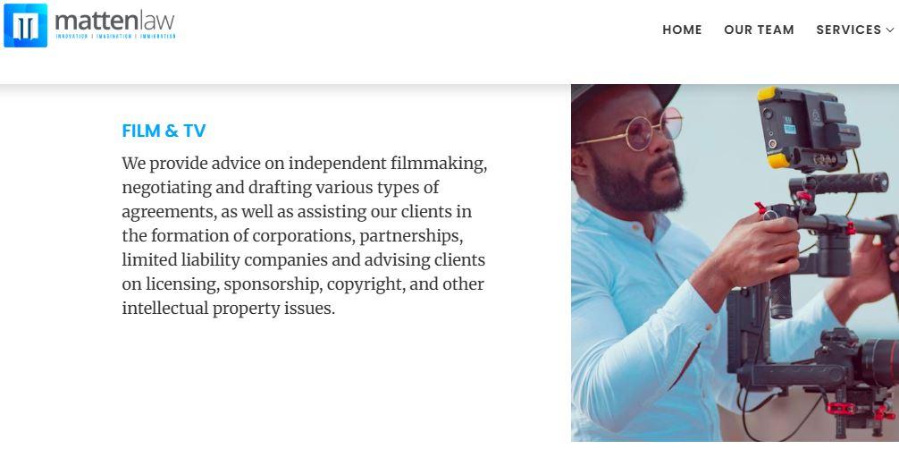
Features bold headlines and easily readable body copy, ensuring scannability. Its minimalist design and measured color contrast further highlight key elements, making it visually appealing.
18. Tax Studio

Uses standard sans-serif fonts that give a clean, confident look, while consistent line height and font weights maintain clarity throughout longer body copy. Its cohesive look communicates trust, transparency, and attention to detail.
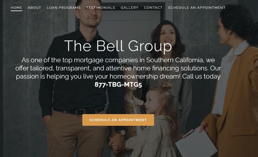
19. The Bell Group
The Bell Group’s professional, geometric sans-serif fonts balance corporate strength and human warmth, while ample white space ensures comfortable reading. Its minimalistic design matches its brand values of stability and transparency.
20. Maxwell Tillman
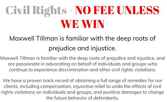
Clean sans-serif fonts paired with subtle contrast and restrained color use, giving the entire layout a refined and professional tone. This design mirrors that of modern legal brands – structured, purposeful, and confident.
Lifestyle & personal brands
Expressive typography defines personal and lifestyle brands. These websites use rounded sans-serif fonts minimalist design elements to feel friendly, modern, and authentic, including the following sites:
21. Field & Foundry
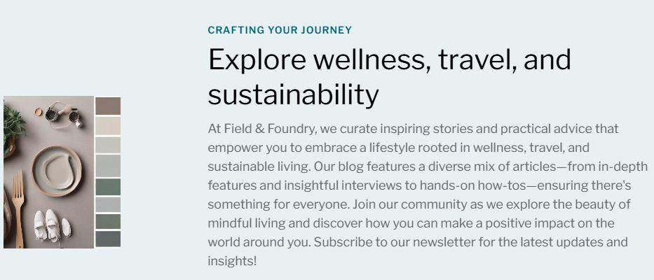
Leans into editorial-style typography and combines structured sans-serif headlines with airy body copy. The typography feels thoughtful and authentic, mirroring its own brand of craftsmanship and creativity.
22. Fresh Start Wellness
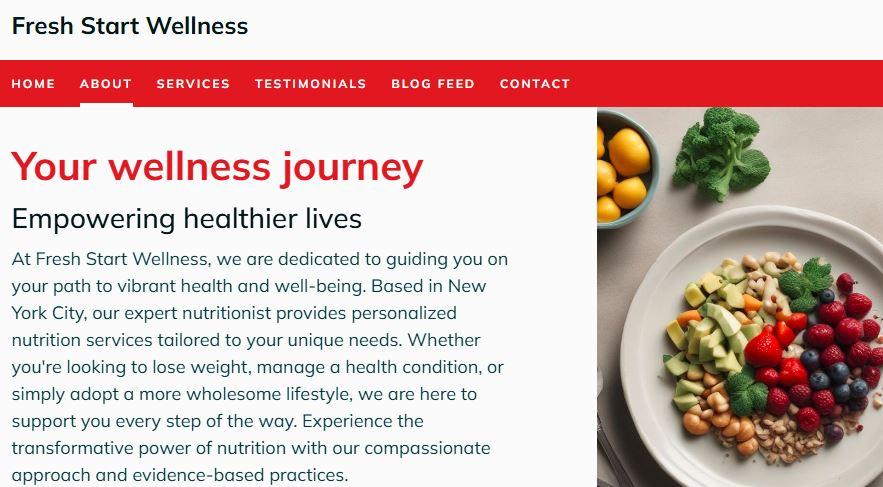
Uses clean sans-serif fonts, strong visual hierarchy between headlines and body copy, and calming whitespace to indicate health, balance, and mindfulness. The minimalist typography perfectly matches the brand’s tone.
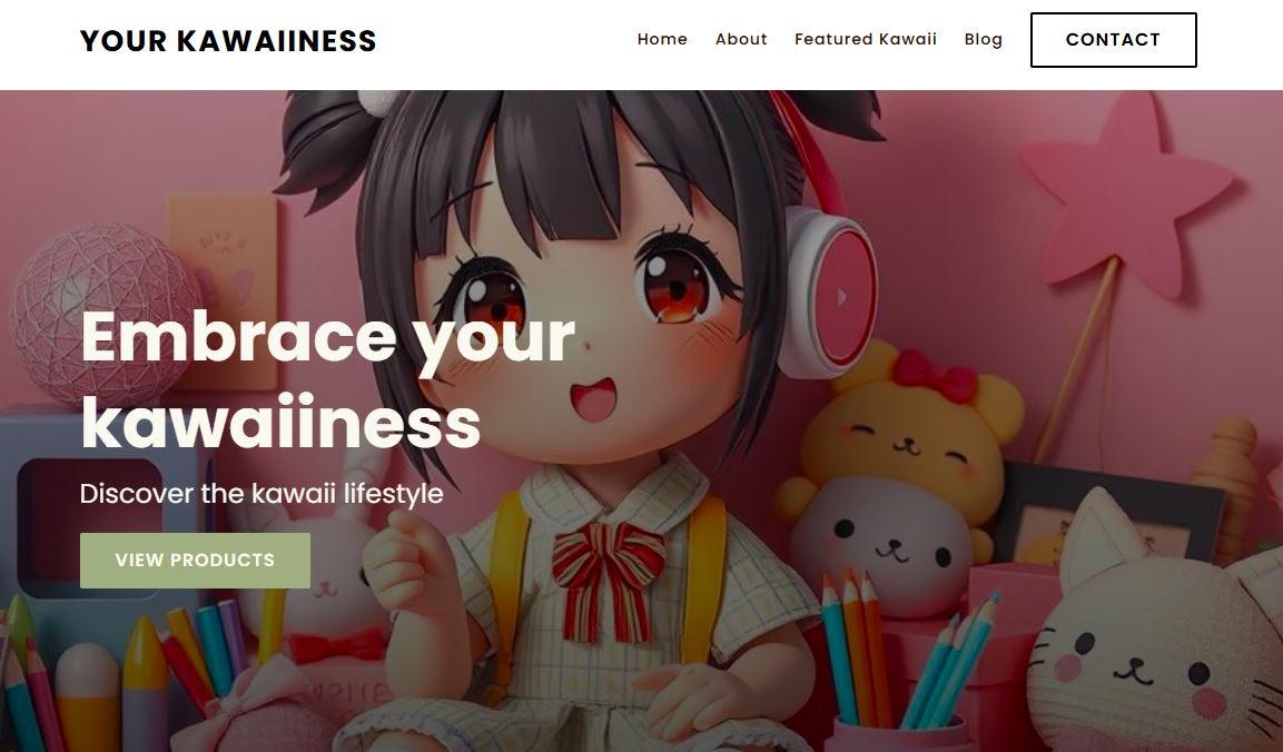
23. Your Kawaiiness
Rounded sans-serif fonts, bold headlines, and subtle typography elements make the layout energetic and engaging. This design matches the brand’s cheerful aesthetic and creates instant connection with its audience.
24. CompactWorks
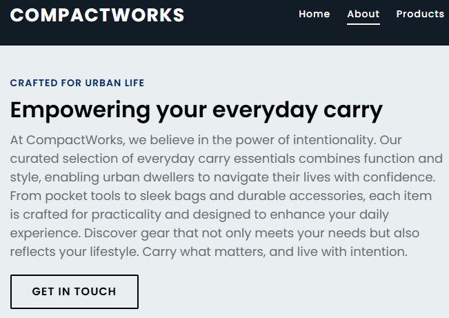
Minimalistic design approach with structured sans-serif fonts and strong line length highlights consistency. By sticking to one or two font types, the design feels focused, cohesive, and accessible across all screen sizes.
Best practices for website typography in 2026
Though typography trends shift, it’s best to stick to the fundamentals because they last. Here are four focused best practices that will keep sites modern and readable.
1. Prioritize accessibility
High color contrast, comfortable font sizes, and clear line spacing help people, including those with visual impairment, to read your text easily. Use accessible contrast ratios and avoid tiny text for key actions like CTAs or bold headlines.
2. Use responsive typography
Fonts must scale across all screen sizes. To avoid cramped mobile paragraphs or awkward spacing on large monitors, use a responsive system that adjusts line height and font size at each breakpoint. For example, B12’s AI design engine uses smart web typography to dynamically adjust line length and spacing, ensuring your body copy remains readable on both wide and compact screens.
3. Don’t overuse decorative fonts
Keep decorative text or handwritten typography for hero sections, headings, taglines, or logo design. These expressive font styles can add flair and visual personality when used strategically.
However, for paragraphs and captions, use neutral fonts, like Nunito Sans or Open Sans, to maintain clarity and professionalism. Overusing ornate styles or different font styles across your web pages can distract users and even break your cohesive brand identity.
4. Test readability across devices
Preview your site on phones, tablets, and desktops to ensure the web pages remain consistent and appealing. Many modern web designers also test interactive elements, ensuring the animations or animated typography don’t reduce clarity or accessibility.
How AI helps you choose the perfect typography (with B12)
AI helps ease the process of choosing the right font combination, making everything faster and with less guesswork. With B12’s AI website builder, you get type systems that match your brand’s voice, audience, and purpose.
Here’s how it works:
1. B12’s AI matches typography to your brand personality
After describing your business, B12’s AI builder analyzes your tone – whether it’s modern, elegant, or bold – then it automatically suggests matching typography styles. It identifies the right font types that reflect your personality while maintaining a cohesive brand identity. This ensures every headline, button, and line of body copy feels intentional and visually aligned.
2. Instantly preview AI-generated font pairings
B12’s builder lets you preview multiple AI-generated typography pairings in seconds. You can experiment with contrasting fonts, explore clean sans serif styles for a minimalist design, or test decorative text options that boost visual interest. This instant preview feature gives you typography inspiration without needing advanced graphic designer skills.
3. Combine AI recommendations with human design expertise
While AI gives you recommendations, B12’s human designers fine-tune every detail through their creative services to ensure a polished finish. This human-AI collaboration ensures your typography looks balanced across all web pages, achieving both readability and visual interest. The result is great typography that performs as well as it looks.
4. Unified AI workflow for cohesive website design
Typography is just one part of B12’s full AI-driven workflow. Its site generation workflow coordinates layout, color palette, visuals, and font pairing to build a consistent website from the ground up.
Everything flows together seamlessly, starting from your landing page to your logo design. This helps you achieve a strong visual hierarchy and minimalist design that perfectly matches your brand identity.
Conclusion
Typography is one of the most important yet overlooked aspects of web design. It shapes your brand’s entire brand voice, apart from defining your website’s appearance. In fact, the best websites don’t just choose fonts for style; they leverage typography to create emotion, trust, and clarity.
AI helps simplify the process of choosing your site’s font by combining aesthetic logic with conversion-focused layout. The right typography can make your brand truly unforgettable to potential clients, whether it’s a bold, creative portfolio or a calm, financial website.
Explore AI website examples in our prompt gallery and see how B12 helps you build beautiful, on-brand websites, including the different fonts.
Look professional online with tips from B12
Receive our email newsletter for advice on how to grow your business and engage clients.
Draft your site in 60 seconds
Get an AI website made specifically for you that's free to launch.
Start for free ✨No credit card required


Spend less time on your website and more time growing your business
Let B12 set up your professional online presence with everything you need to attract, win, and serve clients.