Build an AI website in 60 seconds
AI generates your personalized website instantly with built-in scheduling, payments, email marketing, and more.
Start for free


4 common design elements that will boost conversion (with examples)


It seems like every marketer, designer, and webmaster is looking for the one design element that’ll take their conversion rate to the next level.
Whether it’s spin-to-win pop-ups, shake-effect forms, or eye-catching banners, the result is the same. People get used to what they’ve seen over and over again and start to tune it out.
The human brain can only process 120 bits of information a second but thousands of bits surround us at any moment.
That’s why the CTR (click-through rate) of banner ads went from 70%+ when they first appeared to less than 1% today.
So what can you do to boost your conversion?
Focus on the common parts of every webpage while tapping into human behavior and psychology. When you do it right, visitors will “discover” your desired action on their own. Naturally, conversions will go up.
In this post, you’ll learn the most important design elements used on most web pages and how to use them effectively.
Don’t tweak your website right away
The concepts and examples I’ll share will make it tempting to dive right in and start making changes to your website. I encourage you to resist because a lot of thought should go into your decisions.
What may make sense to you can be confusing to another person. Your goal is to get a visitor to take your desired action with as little friction as possible. The goal of your visitors may be to carefully consider your offer before saying yes.
The challenge is figuring out how to make those two goals align with the largest number of people. This isn’t a five-minute exercise but rather a continuous process known as design thinking.
This method will help you identify the key messages and outcomes your visitors want. You can do this by asking customers questions via surveys or in person, meeting with other members of your team, and reviewing your data. Once you have that information, you can modify the design elements below in a way that boosts conversion.
Let’s dive in!
Provide useful navigation
The starting point isn’t changing your value proposition or altering all the colors on your website. You can begin with something much simpler: your navigation. This is one of the most clicked elements on your website and what you put there (or remove) can directly affect conversions on key pages.
Many brands have trouble balancing this and either put too much information like the image below.
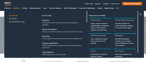
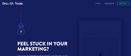
Others put too little information in their menu.
This goes back to design thinking. What do people want to accomplish when they’re on your website? What do they need to understand before they can make an informed decision?
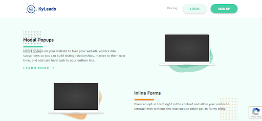
Build your main website navigation around the answers to those questions. For example, the main navigation on the KyLeads homepage is intentionally sparse.
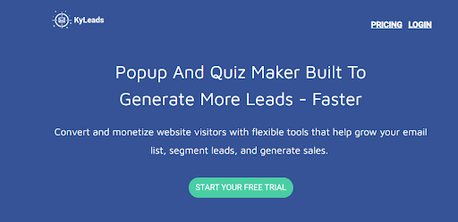
That’s done because people who land on that page want to learn more about the brand, services, and pricing. Most of the necessary information is on the page and links to dedicated product pages are also available.
How do we know this? We asked with a simple survey.
A blog or services website would have different navigation.
When you’re looking for a firm to handle your marketing, website design, or another service, you want to check out their portfolio and the exact services they offer. That’s what’s reflected in the menu.
There are no hard and fast rules when it comes to designing the menu, but here are a few things to consider:
- Make clickable links obvious (underlined or a different color)
- Limit yourself to one nested menu
- Don’t get creative with the location — the menu should be obvious
- Use contrasting and easily readable colors
- Add additional information to the footer
Being deliberate with your menu options does wonders for the overall user experience. It not only complements your brand strategy, but also drives traffic to the key pages on your site. When people are able to locate what they want, purchase your products seamlessly, and receive excellent service, you open the doors to improved customer loyalty. When applied consistently, you open the doors to turning those customers into brand ambassadors.
Use colors properly
There are many schools of thought about how to use colors on your website and countless articles on color psychology. Before I touch on color preferences, I want to focus on how colors can emphasize certain elements on a page and de-emphasize others.
Color usage is especially important when it comes to your call to action (CTA). If used well, it’ll draw the eyes and elicit more interaction. When used incorrectly, your most important action blends in with the background.
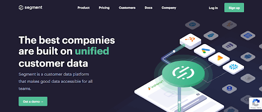
In the image above from Segment, the CTA buttons present a clear contrast against the dark background and draw the eye toward the major action a website visitor can take.
Look at the pages you’ve already built. Are the main CTA buttons all the same color? Do they link to the same place? If not, you may cause confusion for your visitors. If people are confused, they’re more likely to leave your site, and the effort used to generate traffic is wasted.
If you haven’t done so already, develop a color palette for your website. This is more than a branding play, it can help people understand how to use your website. Here are some guiding questions that you can consider during the design phase of your website CTAs:
- What colors are your primary and secondary CTAs?
- What colors can be used for page headings?
- Do you have specific colors reserved for imagery?
- What colors can you use for sections within a page?
It may seem like you’re being too specific but this goes a long way toward reducing the cognitive load on your site visitors. According to Cognitive Load Theory, if there’s too much information presented to a learner at once, they’ll block out receiving additional inputs.
If visitors are forced to understand your website design every time they enter a new page, it’ll be harder for them to focus on the information presented.
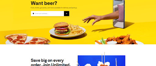
Notice how Postmates clearly demarcates between one section of the page and the next with the two colors: yellow and white. This lets the visitor know that they should expect new information.
Another thing to consider is when you have multiple CTAs but one is more important. In that situation, you’d want to emphasize one and de-emphasize the other using colors or a lack of colors.
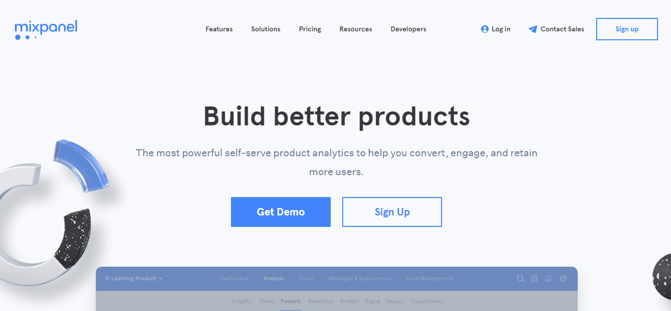
In the image above, the product analytics tool Mixpanel allows visitors to sign up or get a demo. It’s clear that requesting a demo is the desired action. This may be due to the fact that people who sign up on their own have lower activation rates.
According to another study, genders have specific color preferences. 57% and 14% of men cite blue and green as their favorite color, respectively, while 35% and 23% of women cite blue and purple as their favorite color, respectively.
If you have an audience of predominantly one gender, you may want to consider using a color palette that appeals to the majority.
According to the same study, preferences change with age. It seems that younger people prefer green more than older people, but all ages like blue. Take what you know about using CTAs and color preferences across demographics and combine it with modern design trends to make the most of your website.
Consider white space and page proportions
White space, also known as negative space, is one of the most difficult things for people without a design background to get right. It’s simply the areas of a page that aren’t filled with other design elements.
Instinctively, you know when the proportions of white space are too large or too small, but fixing it is another thing entirely.
The above image is a draft of a page on our website. At this point in the design process, the individual sections were too close together and interfere with each other. Before a visitor can finish interacting with the first set of information, the next one is already demanding attention.
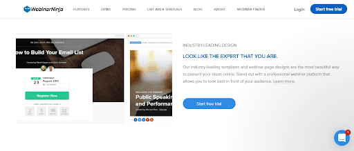
This image is from a webinar software tool that caters to experts and creators and has many element groupings like the first image. The difference is that there is ample white space between sections so that the visitor can focus his/her attention on the main text. There are two types of white space:
- Macro. This is the distance between larger elements on a page, such as two images, buttons, menus, paragraphs, etc.
- Micro. This is the space between smaller elements on a page like character spacing, line height, word spacing, etc.
Within macro white space, there are two classifications called active and passive. The active white space helps guide users through an experience on the page. Passive whitespace forms naturally without direct input from the designer. An example of passive space is the area between an image next to a heading.
Think of white space as the glue that holds your design together. Without it, there would be no way to understand when one element ends and another begins.
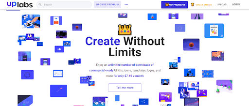
In the image above from UpLabs, I find the use of white space jarring. Though it shows where the major element in the center ends, I feel the design is too busy and draws my attention away from the main message.
Here are a few things to consider when creating negative space:
- What are you trying to communicate and has the white space enhanced or distracted from that message?
- Does the use of negative space affect information hierarchy?
- What kind of mood does the space elicit?
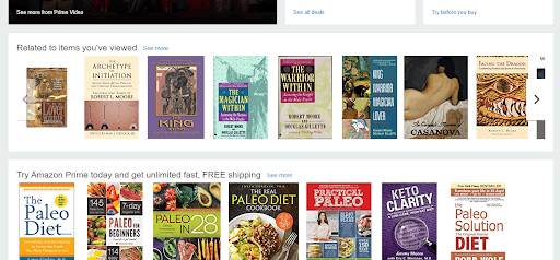
See how Amazon is a bit crowded, as you’d expect from a large marketplace with millions of products.
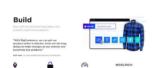
BigCommerce, on the other hand, has a cleaner interface and relies on white space to emphasize and de-emphasize important elements.
Understand visual hierarchy and content layout
Another important aspect of your design is how you’ve laid out elements and what draws the eyes first and last. Just because something is shown first on the page doesn’t mean it’s what people will look at first.
There have been many studies showing that people look at the left side of the page first, move over to the right of the page, and then move down and repeat the process.
While this is a common way to read online, it has received undue attention. There are many ways people interact with web pages and it’s determined by multiple factors, including:
- Their purpose or goal
- Assumptions from similar websites they’ve visited in the past
- The layout of the page
- What’s on the page
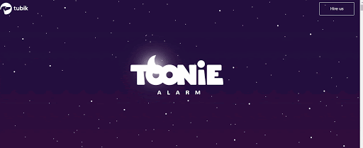
In the example from Toonie below, scrolling doesn’t move the page down. Instead, it changes what’s in the phone mockup. A visitor wouldn’t look from left to right, instead, they’d be fixated on one point as it changes.
Likewise, you can change how people view your web page by creating a clear visual hierarchy. The first element or words on a page aren’t always absorbed first. The ones that have the most emphasis, usually in relation to size, are seen first.
Here are the major factors to take into consideration for proper visual hierarchy:
- Size matters and can determine what’s in the foreground or background
- Perspective can create depth
- Contrast draws attention, so use it wisely
- Fonts (and their colors, size, and position) are the glue to a design
- The closer elements are, the greater the assumption of a relationship
- The way things are aligned can direct the eyes
Rework your website design for improved conversion
This guide has assessed design elements that are on almost every website. Instead of chasing the next big thing to give you a conversion boost, don’t forget to go back to basics.
Ensure your navigation serves the people who come to your website, use colors to demarcate areas of a page, emphasize calls to action, don’t leave white space to chance, and carefully consider your site’s visual hierarchy.
Once you get these right, all you have to do is tweak it until your conversion rate reaches its full potential.
Bio: Daniel Ndukwu is the Founder of KyLeads. There, he helps small business owners and entrepreneurs better understand their customers and turn them into leads using smart popups and interactive quizzes. When not working, he tackles multiple side projects and spends time with his family.
Draft your site in 60 seconds
Get an AI website made specifically for you that's free to launch.
Start for free ✨No credit card required


Spend less time on your website and more time growing your business
Let B12 set up your professional online presence with everything you need to attract, win, and serve clients.