The dos + don’ts of how to use your logo in your website design
A website is the online home of your business, so it’s safe to say it’s one of the most prominent places your logo will appear.
Not only does your logo reinforce your brand identity in the website header and favicon (the small image beside your URL), it also makes the experience more enjoyable by orienting the user and allowing them to get back to your homepage at any time by clicking the logo.
In this post, we’ll walk you through the dos and don’ts of how to use your logo in your website design, starting with the “dos.”
Do: Left-align your logo and link it back to your homepage
Left-aligning logos on websites comes with some history. In the past, browsers were typically fixed, meaning that logos placed on the right (or even centered) sometimes didn’t appear, depending on the size of the screen or shape of the browser window.
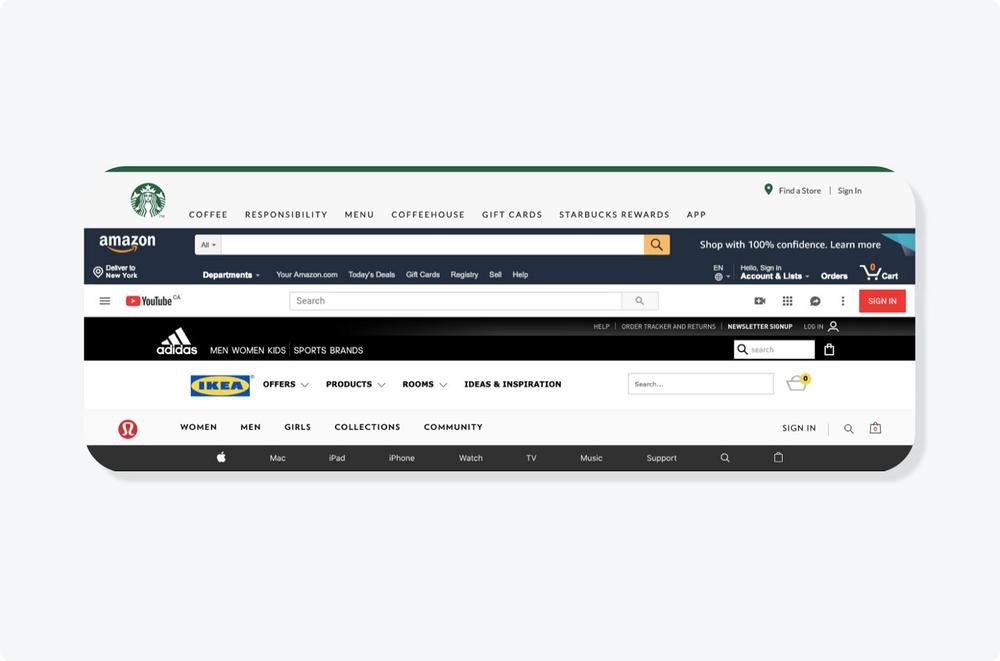
Western society’s deep-rooted habit of reading left-to-right has carried over to both website and mobile design. Below, you can see how iconic brands from Starbucks to Apple have adopted the left-aligned logo approach:
Because people are used to seeing logos sitting in the top-left corner, placing your logo there comes with major orientation benefits from a user experience perspective. A logo positioned anywhere else could confuse people, or even lead to poor user experience and a higher bounce rate.
You may come across a centered logo on content-heavy websites like news outlets and magazines — and this can work (it may also be the default position in the website theme or template you choose).
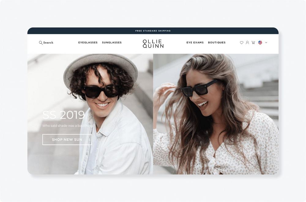
Independent eyewear brand Ollie Quinn executes the center-aligned logo well, as it doesn’t conflict with other elements of the page and works with the site navigation.
Do: Use a PNG version of your logo with a transparent background
Your logo should come in a few different color variations: full-color, black, white, and transparent background. A transparent background version of your logo is usually the best option for websites, as a colored background won’t always match the color of your pages.
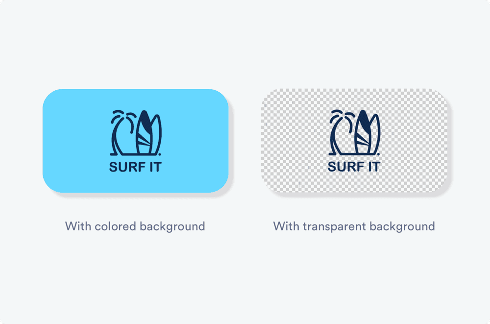
For example, if you used the below logo with the blue background, it would stick out and look clunky when placed on a white-background website. But if you uploaded a logo file with a transparent background (below right), it would work seamlessly on almost any color.
Another factor to consider is contrast. If your website has a pale yellow background, it may not be the best idea to use the all-white version of your logo due to the lack of contrast, which can hinder your website’s accessibility.
Note: The best type of logo file to use for digital applications is a PNG. These files can display millions of colors, and they support transparent backgrounds. If you use a JPEG, your logo may not show up as clearly as you’d like.
Do: Know which variations of your logo to use
Along with color variations, your logo may also have a “primary” version (the full version of the logo) and a “secondary” version, which could be a symbol- or monogram-only variation to use in smaller spaces. If you have a slogan, you may also have variations with and without the slogan.
While you’ll likely use the full version of your logo in your website header, you’ll also want to consider the favicon, the little symbol next to the URL within a browser tab that measures a tiny 16 x 16 pixels or 32 x 32 pixels. It’s best to use a symbol-only or monogram version of your logo in this spot for legibility.
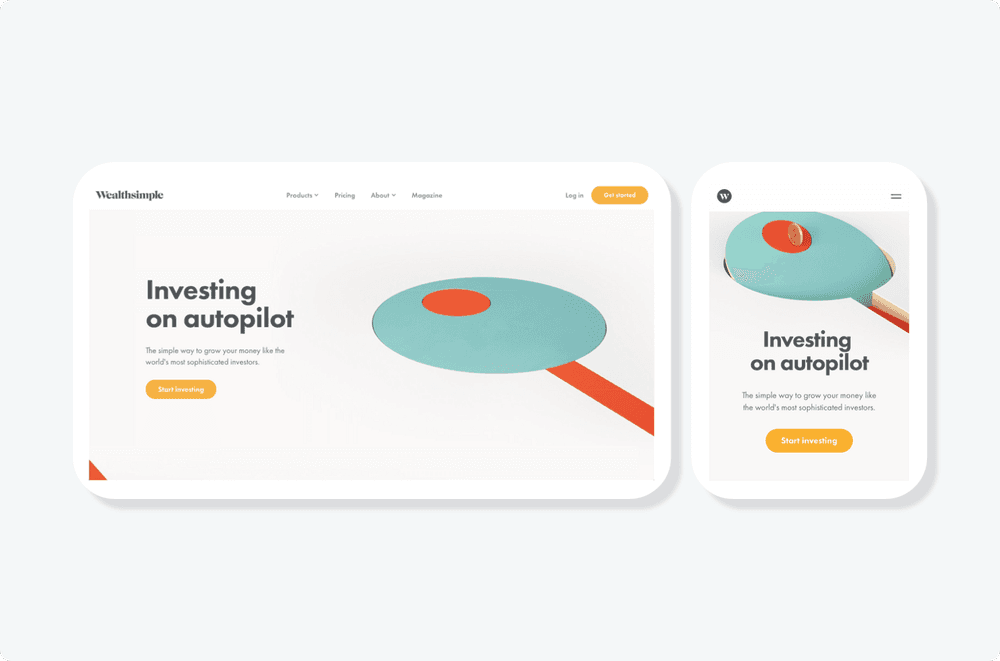
Wealthsimple’s website is a case where a company has nailed an understanding of how to use the different variations of their logo. The main wordmark version of the logo has been applied to the desktop site, whereas the monogram-only version is used on the mobile site to save space.
Do: Create a holistic branded experience
Reinforce your brand by popping your logo into areas other than the navigation bar: the footer, product photos, and throughout the checkout flow if you have an ecommerce site.
Don’t be shy to play up your brand colors as well — you can incorporate them in website design elements like on-page text, buttons, forms, image backgrounds, and more.
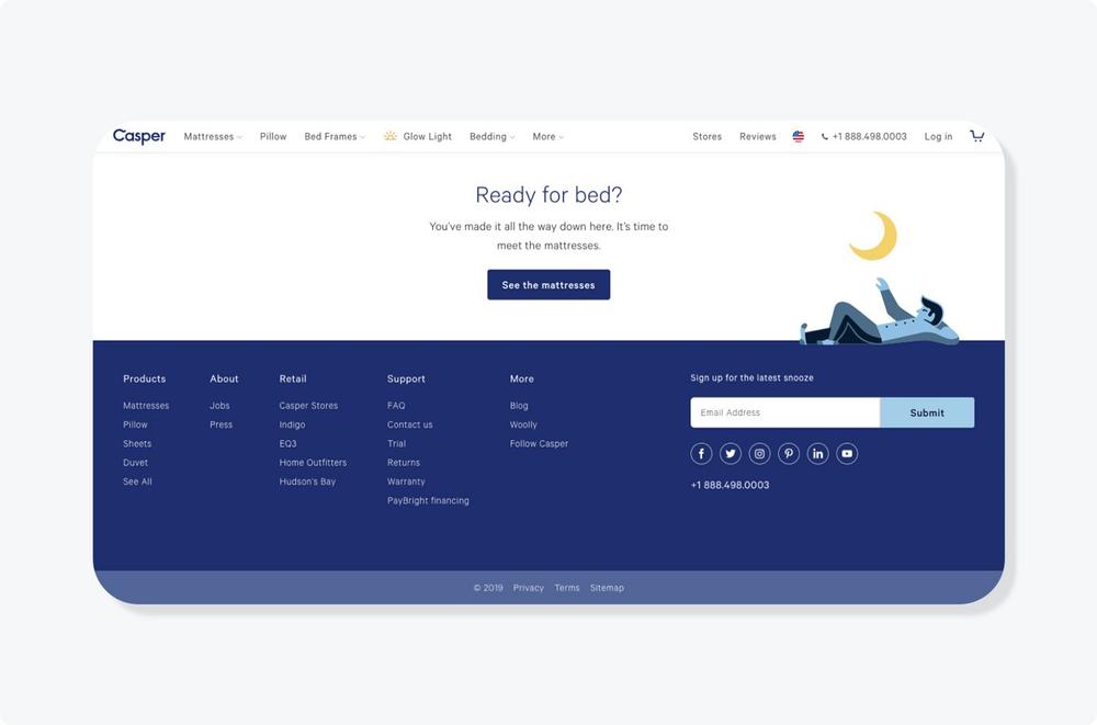
Casper does a solid job of delivering a unified branding experience to their website by maintaining a consistent color scheme through the logo, text, UI, and footer.
Pro tip: Following a documented set of brand guidelines will make it easier to give you direction in creating a branded website — using a platform like Looka can help with that!
Now, let’s move on to the “don’ts”…
Don’t: Make your logo too big or too small
You want to ensure your logo is clear and readable on all devices and screen sizes. A logo that’s too big will overpower the other content on the top half of your page, such as key messaging and navigation items. Using your logo more than once above the fold is excessive and draws attention away from other information users may be looking for.
At the other end of the spectrum, a logo that’s too small will be hard to read, so you run the risk of it not getting noticed when someone first lands on your website. It’s especially important to get sizing right if your logo uses a thinner font, a slogan, or a symbol.
Don’t: Cut off your logo
Placing your logo too close to page margins doesn’t give it enough breathing room, resulting in a logo that’s cut off — and not in a “this is intentional” way. This makes your logo easy to miss, and can even negatively affect navigation. After uploading your logo to your website builder, preview it and resize as needed to make sure this doesn’t happen!
Tying your logo into your website design may seem like a no-brainer task, but it’s an important one. Take time to gather the correct files and variations, experiment with placement and sizing, and look for opportunities to use your logo, brand colors, and fonts throughout your website.
Remember:
- Left-align your logo and link it back to the homepage
- Have logo variations (including a transparent background) and use them appropriately
- Reinforce your brand colors and fonts throughout your website design
- Make sure your logo isn’t too big, too small, or cut off
Want to know where else you can use your logo? Check out these 18 branding ideas!
About the author
Kim is a content marketer at Looka, an AI-powered logo maker that provides business owners with a quick and affordable way to create a beautiful brand.
Read next
See all
Trusted by 1M+ users: Our most personalized Website Generator yet
Build custom websites faster, add new pages in seconds, and manage multiple sites effortlessly
Read now
OpenAI features B12’s Website Generator in the GPT Store
Create and customize your website directly in ChatGPT using DALL-E
Read now
Lightning-fast website creation with B12's generative AI
Generate your tailored website in one click. To make edits, regenerate any section instantly.
Read now